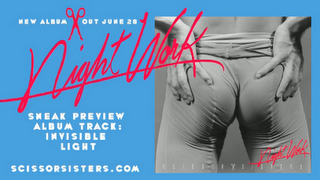
 Here is an example of an original Scissor Sisters album displayed on their website. It uses a bright blue background which stands out with the dominant image being the album cover that is being advertised. The album cover is in a grey tone which helps all the other information on the page to stand out. It shows a sexual image which suggests a fun, wild and outgoing theme to the album. The album cover also has the album name is in script typography that is similar to a persons handwriting. This makes it more personal to the audience and the bright pink colour helps it stand out on the grey background. The advert tells us in bold wide typography information that there is a new album out on June 20th. This stands out on the blue background and has The Scissor Sisters original brand logo of a a pair of scissors separating the piece of information to make it more appealing to look at and as iconography for the brand. The same album logo 'nightwork' is used at the top of the advert again in a signature style font that covers the image of the album cover to make it even more like someone has signed it. The text tells us 'Sneak preview album track: Invisible light'. This gives the audience the impression that the band is giving them unheard music and they are the first to hear it. It suggests that they are giving their fans something in return for being loyal and are privileged to hear it. The same bold white typography is used again throughout to keep with the themes of the advert. The advert is also used as a way of broadcasting the bands website as at the bottom the text reads 'scissorsisters.com'. Even though I got the advert from the bands website it will most likely be marketed in a number of places such as magazines, billboards and music channels, therefore the website information will apply to them and get more people visiting the website on information for the new album and the offer of an exclusive track. The advert is a very simple design made purely of an image of the album cover, text and a logo. Although it is very basic the bright colours make it stand out and appeal to the audience. The information given is very small and short but tells exactly what it needs to and no unnecessary extra information. Therefore the information it does give is more memorable to the audience. Overall I think the advert is very affective in doing what it aims to and is a good way of marketing the new album which comes across and appeals to the fans whilst also broadcasting the group and its brand.
Tuesday, 15 February 2011
Advert Research Analysis
 Here is an example of an original Scissor Sisters album displayed on their website. It uses a bright blue background which stands out with the dominant image being the album cover that is being advertised. The album cover is in a grey tone which helps all the other information on the page to stand out. It shows a sexual image which suggests a fun, wild and outgoing theme to the album. The album cover also has the album name is in script typography that is similar to a persons handwriting. This makes it more personal to the audience and the bright pink colour helps it stand out on the grey background. The advert tells us in bold wide typography information that there is a new album out on June 20th. This stands out on the blue background and has The Scissor Sisters original brand logo of a a pair of scissors separating the piece of information to make it more appealing to look at and as iconography for the brand. The same album logo 'nightwork' is used at the top of the advert again in a signature style font that covers the image of the album cover to make it even more like someone has signed it. The text tells us 'Sneak preview album track: Invisible light'. This gives the audience the impression that the band is giving them unheard music and they are the first to hear it. It suggests that they are giving their fans something in return for being loyal and are privileged to hear it. The same bold white typography is used again throughout to keep with the themes of the advert. The advert is also used as a way of broadcasting the bands website as at the bottom the text reads 'scissorsisters.com'. Even though I got the advert from the bands website it will most likely be marketed in a number of places such as magazines, billboards and music channels, therefore the website information will apply to them and get more people visiting the website on information for the new album and the offer of an exclusive track. The advert is a very simple design made purely of an image of the album cover, text and a logo. Although it is very basic the bright colours make it stand out and appeal to the audience. The information given is very small and short but tells exactly what it needs to and no unnecessary extra information. Therefore the information it does give is more memorable to the audience. Overall I think the advert is very affective in doing what it aims to and is a good way of marketing the new album which comes across and appeals to the fans whilst also broadcasting the group and its brand.
Subscribe to:
Post Comments (Atom)
No comments:
Post a Comment