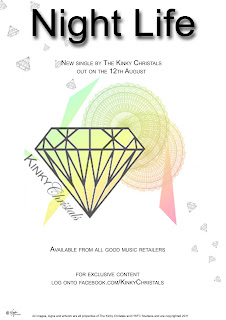
 This is the advert we created for our music video by using photoshop. We advertised it in the form of a single with the information in small black typography giving information on when the single is released. This makes it simple but informative similar to the Scissor Sisters advert I analysed. The single name Nightlife is in very large bold typography at the top of the page standing out to our audience. We used our band logo which is part of the kinky crystals brand as the dominant image. This helps as a marketing technique for our brand and is recognisable to our fans. We changed it slightly to match our digipak image and used the same colour spectrum of colours involving a range from green to pink. This adds some of the fun themes from our video and refers to the colours of our digipak making it all part of the Kinky Crystals brand. We give information on where the single is available from in small text underneath. We have used language as a way of connecting with our audience. An example of this is 'exclusive content'. This appeals to our close fans and suggests that they are privileged in receiving something back from the band. We have also converged other media technologies such as the social networking site Facebook. This way our audience can connect with us in a number of different ways to suit them. We have also added a small copyright disclaimer at the bottom of our advert along with our bands record company logo. This makes our advert more authentic and displays the important information needed.
Tuesday, 15 February 2011
Advert
 This is the advert we created for our music video by using photoshop. We advertised it in the form of a single with the information in small black typography giving information on when the single is released. This makes it simple but informative similar to the Scissor Sisters advert I analysed. The single name Nightlife is in very large bold typography at the top of the page standing out to our audience. We used our band logo which is part of the kinky crystals brand as the dominant image. This helps as a marketing technique for our brand and is recognisable to our fans. We changed it slightly to match our digipak image and used the same colour spectrum of colours involving a range from green to pink. This adds some of the fun themes from our video and refers to the colours of our digipak making it all part of the Kinky Crystals brand. We give information on where the single is available from in small text underneath. We have used language as a way of connecting with our audience. An example of this is 'exclusive content'. This appeals to our close fans and suggests that they are privileged in receiving something back from the band. We have also converged other media technologies such as the social networking site Facebook. This way our audience can connect with us in a number of different ways to suit them. We have also added a small copyright disclaimer at the bottom of our advert along with our bands record company logo. This makes our advert more authentic and displays the important information needed.
Subscribe to:
Post Comments (Atom)
No comments:
Post a Comment