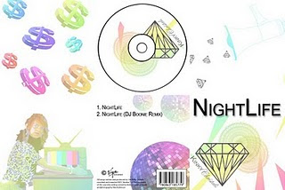
This is our digipak we created. To create the digipak we used Adobe photo shop. The front cover consists of The song name in Bold capital typography. This is simply so it stands out and is easily recognicable for our audience. We used our group logo as the dominant image on our cover. This is to create recognition as a group and to show our music is important to us. The megaphone is used in our inlay cover as it is a prop that appears regularly in our music video. We did this to try and create iconography that is represnted with our music video which will then become part of our become part of our brand. The diamonds are also a theme we have used throughout our music video and media products. This is to connect it to our logo again as recognition of the group. The dollar signs have been used in a similar way in which they appear on our music video background. The dollar signs are all different sizes and are used as intertextuality with our music video for the line 'It's the cash your making'. This reflects the laid back outlook on life that money isnt important as it gets thrown about in our music video. An image of Sam from the music video has been used where she turns the TV on. The TV prop we created is used throughout our music video asthough our video is being shown on the TV. We did this as the use of costumes makes our video all performance based and we wanted to emphasis the performance side of our video through our digipak. It is also to encourage the audience to watch our video on the TV. As sam is wearing a leopard print top in the image it emphasis the wild strange performance side of our video. The back of our digipack contains our song title and the remix version of our song in the same typography that we have used on the front cover, making it stand out and simple to read. We used a large disco ball to represent the glamour side to our music and to show some of the themes expected in our video. We put a barcode, record company and copyright information on our back cover to make it authentic and realistic to our audience. Throughout our digipak we have used the same faded rainbow colour themes. This represents the fun themes and energy interpretated through our music and the same colours that are used in our music video. This creates the Kinky Crystals brand for our group.
No comments:
Post a Comment