Evaluation on Prezi
Wednesday, 30 March 2011
Friday, 18 March 2011
Feedback
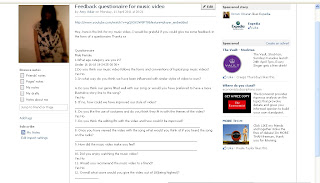 As well as giving my questionaires out I decided to post a link on my facebook page to my music video and a template of the questionaire in the hope that some people may fill it in. Facebook would not let me post my questionaire in the form of a post as it took up too many characters so I had to paste it into a note form post. By posting it onto Facebook I could broadcast it to a wider audience of 716 friends I have previously added on the social networking site. The high levels of technology allow me to converge the two
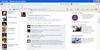 types of media into the form of read only media and web 2.0 with the opportunity of commenting on the post. Unfortunately nobody replied with the questionaire, presumably because it was so time consuming and impracticle however I did recieve a few comments and advice on the music video which was a great source of feedback. In the future i will look into recieving feedback in other forms of media. (Click image to enlarge)
Audience Feedback
This is the questionaire we gave to our audience to get some feedback for our music video. We gave them out to 20 students from our college and 20 people outside of college to get a variety of audience responses. We used 12 questions with quantitative data and answers to chose from and qualitative data that the participant has wrote either through a comment or response to a question with advice, opinions and negative points. To analyse our results I created graphs showing me my results and the comments people have left me.
1. What age category are you in?
under 16- 2
16-18- 25
19-24- 7
25-30- 5
30+ - 1
Yes- 37
No- 40
3. In what way do you think we have been influenced with similar styles to ours?
'It reminds me of other Scissor Sisters videos'
4. Do you think our genre fitted well with our song or
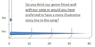 would you ave preffered to have a more illustrative story line to the song?
Yes- 39
No-1
5. If no How could we improve our style of video
-'I personally like video's with a story line or something to follow with the music'
-'You could have tried more to mix a storyline with surrealism, such as Katy Perrys California Girls'
6. Do you like the use of costumes and do you think they fit in with the themes of the video?
Yes- 40
7. Do you think the editing fits with the video and how could it be improved?
-'Without the editing the whole video would be very dull'
-'The editing is done very well and It doesn't need improving in anyway'
-'I especially like the moving and flashing backgrounds, it is very effective'
-'It fits with the style of video'
-'To make the video better I would improve continuality'
-'I like the editing'
-'You could make it flow more and the shots fit together'
8. Once you have viewed the video with the song what would you think of if you heard the song on the radio?
-'The megaphones and flashing backgrounds'
-'Slow walkers in line at the end'
-'megaphones woo woo'
-'body popping in time to the music'
-'flashing backgrounds'
-'Nightlife'
-'cones'
-'megaphones'
-'slow walks in line'
-'walking with megaphones'
9. How did the music video make you feel?
-'fun, lively and portrayed my feelings afterwards'
-'I want to join in and sing with attitude'
-'Reminded me of my youth'
-'I wanted to sing along even though I didn't know the words'
-'fun'
-'I wanted to dance'
-'It was lively and got my attention'
10. Did you enjoy watching the music video?
Yes-40
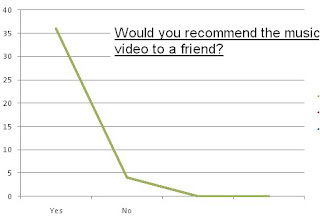
11. Would you recommend the music video to a friend?
yes- 36
No-4
12. Overall what score would you give the music video out
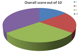 of 10(being highest)?
7/10- 6
8/10- 8
9/10- 12
10/10- 14
Friday, 18 February 2011
Final Video
Progression from Rough Cut
From taking bullet points on my rough cut I could identify what needs doing to complete my final video. Firstly I identified I needed more footage of the chorus so we could mix up a number of different shots and angles, therefore we filmed on the 11th November and added our footage into the appropiate point in the video. After placing the number of different shots in place we developed our video by creating individual backgrounds for each shot to create a variety of different images and add colour to our video. We progressed with this further through using motion paths on the backgrounds to give the impression our backgrounds were moving or flashing. This added the energy and liveliness which we identified as a key convention as pop mucis videos. We slowed some shots down such as when we walk with a microphone in a line, this created thoughtbeats in our video, and we sped some up such as pulling the cones of Alex's top. This added the speed we needed which gave the impression we had more shots in the video and allowed us to fit it intime with the music. From our rough cut we took some shots out that we felt were unnecessary, this was the shot of Alex with the balloons and the repeated shot of Alex and Sam on the chorus. We felt the balloon idea did not fit with our themes and we neede dto create more shots for the repeated chorus. We also changed some of the shots of Amy and Sam as we felt the green screen had not worked how we had hoped as our costumes contained the colour green and the chroma keyer tool had taken away the green parts of our costumes. This is obvious in the shot showing Amy's leggings as it look like there are holes in her legs. We felt this would not be suitable and professional in a real music video. We also edited the beginning shot of our music video where Sam says 'Do it now'. We felt the close up shot looked too pixilated and rushed so we changed it to a shot of Sam moving in time to the music. I felt this fit better and we had progressed hugely from our original rough cut.
Progression from Animatic Storyboard
We changed a number of things in our story board whilst producing our music video, this was simply because we were unable to get hold of some props or it was impractical to shoot the shot. At the begining of our storyboard we show a record player being turned on with the Kinky Crystals playing, we had to change this as it was not practical to bring my record player into college as it may get damaged and was too large to carry, there was also not one available in college. We decided to change some of the dance routines and movements shown in our storyboard as we thought it was too cliche and we wanted to change it by having short snippets of performance based dance during our video. It would also be boring for the audience to watch a 16 bar repeated dance routine. We also show Alex throwing a doll away in the first shot however we felt it would be more entertaining for him to dress as a women wearing a womens wig and throwing that away instead. In some shots we developed our story board ideas. An example of this is having the music notes as a background in the story board but in our final video we show the music notes coming from the megaphone. We felt this fit better with the verse. Another way which we developed our ideas by using technology is the idea of Sam having a lightbulb pop up at the side of her head but instead we used the Final Cut programme to create a motion path of the lightbulb moving up and around her body. This advanced our use of technology and helped progress our video. We shot some footage using the animal masks from the performing arts department that we had planned to use in our props list. However we cut this footage from our rough cut as we felt although we were going for a surreal theme, it did not fit with the rest of our themes through the song such as the glamour side through the use of crystals. We developed the idea of spinning in some shots by using a hoola hoop prop instead, this created a weird unusal feel to our video of all the fast shots. We had originally planned to edit our footage into a split shot into 4 sections on screen. However when it came to editing we felt it had been over used lots of times in music videos and would not be unique to us.
Wednesday, 16 February 2011
Rough Cut
This is a rough cut of our music video
Construction of video
This is our rough cut of our music video that we created to put our general ideas down. To progress our work firstly we need to place all of our footage in the correct order for our video by using Final Cut. Once we have done this we can work on timing the shots to the music and to fit the footage with different thoughtbeats and lyrics in the song. After piecing our video together we need to focus on creating backgrounds and editing our video to make it more interesting. Eventually when we have created a background we may add motion paths and special effects to make our video unique.
So far I like the direction our video is going in and think the footage at the begining of our video along with the coloured background on the 'Woo Woo' shot is very effective and would like to follow these themes and effects throughout our video. We have started to experiment with motion paths with the use of a light bulb around Sam for the 'I had a break through' line. Hopefully we can progress these skills further by praactising them throughout our video. I like the way the chorus looks with the backgrounds starting to develop however I feel like we need more footage for this section of the song and need to focus on placing our footage in place before editing with backgrounds and timing so we have a base to work with.
Points to progress:
-Film more footage for Nightlife chorus
-Footage in place
-Create simple backgrounds
-Edit timing to create thoughtbeats and fit footage with the music
-Progress backgrounds through the use of motion paths and PhotoShop
Tuesday, 15 February 2011
Advert
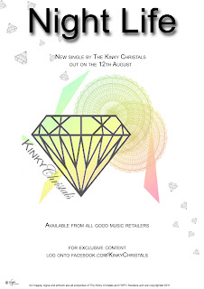 This is the advert we created for our music video by using photoshop. We advertised it in the form of a single with the information in small black typography giving information on when the single is released. This makes it simple but informative similar to the Scissor Sisters advert I analysed. The single name Nightlife is in very large bold typography at the top of the page standing out to our audience. We used our band logo which is part of the kinky crystals brand as the dominant image. This helps as a marketing technique for our brand and is recognisable to our fans. We changed it slightly to match our digipak image and used the same colour spectrum of colours involving a range from green to pink. This adds some of the fun themes from our video and refers to the colours of our digipak making it all part of the Kinky Crystals brand. We give information on where the single is available from in small text underneath. We have used language as a way of connecting with our audience. An example of this is 'exclusive content'. This appeals to our close fans and suggests that they are privileged in receiving something back from the band. We have also converged other media technologies such as the social networking site Facebook. This way our audience can connect with us in a number of different ways to suit them. We have also added a small copyright disclaimer at the bottom of our advert along with our bands record company logo. This makes our advert more authentic and displays the important information needed.
Advert Research Analysis
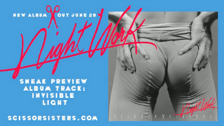 Here is an example of an original Scissor Sisters album displayed on their website. It uses a bright blue background which stands out with the dominant image being the album cover that is being advertised. The album cover is in a grey tone which helps all the other information on the page to stand out. It shows a sexual image which suggests a fun, wild and outgoing theme to the album. The album cover also has the album name is in script typography that is similar to a persons handwriting. This makes it more personal to the audience and the bright pink colour helps it stand out on the grey background. The advert tells us in bold wide typography information that there is a new album out on June 20th. This stands out on the blue background and has The Scissor Sisters original brand logo of a a pair of scissors separating the piece of information to make it more appealing to look at and as iconography for the brand. The same album logo 'nightwork' is used at the top of the advert again in a signature style font that covers the image of the album cover to make it even more like someone has signed it. The text tells us 'Sneak preview album track: Invisible light'. This gives the audience the impression that the band is giving them unheard music and they are the first to hear it. It suggests that they are giving their fans something in return for being loyal and are privileged to hear it. The same bold white typography is used again throughout to keep with the themes of the advert. The advert is also used as a way of broadcasting the bands website as at the bottom the text reads 'scissorsisters.com'. Even though I got the advert from the bands website it will most likely be marketed in a number of places such as magazines, billboards and music channels, therefore the website information will apply to them and get more people visiting the website on information for the new album and the offer of an exclusive track. The advert is a very simple design made purely of an image of the album cover, text and a logo. Although it is very basic the bright colours make it stand out and appeal to the audience. The information given is very small and short but tells exactly what it needs to and no unnecessary extra information. Therefore the information it does give is more memorable to the audience. Overall I think the advert is very affective in doing what it aims to and is a good way of marketing the new album which comes across and appeals to the fans whilst also broadcasting the group and its brand.
Digipak
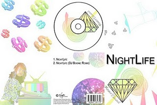
This is our digipak we created. To create the digipak we used Adobe photo shop. The front cover consists of The song name in Bold capital typography. This is simply so it stands out and is easily recognicable for our audience. We used our group logo as the dominant image on our cover. This is to create recognition as a group and to show our music is important to us. The megaphone is used in our inlay cover as it is a prop that appears regularly in our music video. We did this to try and create iconography that is represnted with our music video which will then become part of our become part of our brand. The diamonds are also a theme we have used throughout our music video and media products. This is to connect it to our logo again as recognition of the group. The dollar signs have been used in a similar way in which they appear on our music video background. The dollar signs are all different sizes and are used as intertextuality with our music video for the line 'It's the cash your making'. This reflects the laid back outlook on life that money isnt important as it gets thrown about in our music video. An image of Sam from the music video has been used where she turns the TV on. The TV prop we created is used throughout our music video asthough our video is being shown on the TV. We did this as the use of costumes makes our video all performance based and we wanted to emphasis the performance side of our video through our digipak. It is also to encourage the audience to watch our video on the TV. As sam is wearing a leopard print top in the image it emphasis the wild strange performance side of our video. The back of our digipack contains our song title and the remix version of our song in the same typography that we have used on the front cover, making it stand out and simple to read. We used a large disco ball to represent the glamour side to our music and to show some of the themes expected in our video. We put a barcode, record company and copyright information on our back cover to make it authentic and realistic to our audience. Throughout our digipak we have used the same faded rainbow colour themes. This represents the fun themes and energy interpretated through our music and the same colours that are used in our music video. This creates the Kinky Crystals brand for our group.
Monday, 14 February 2011
Subscribe to:
Comments (Atom)


